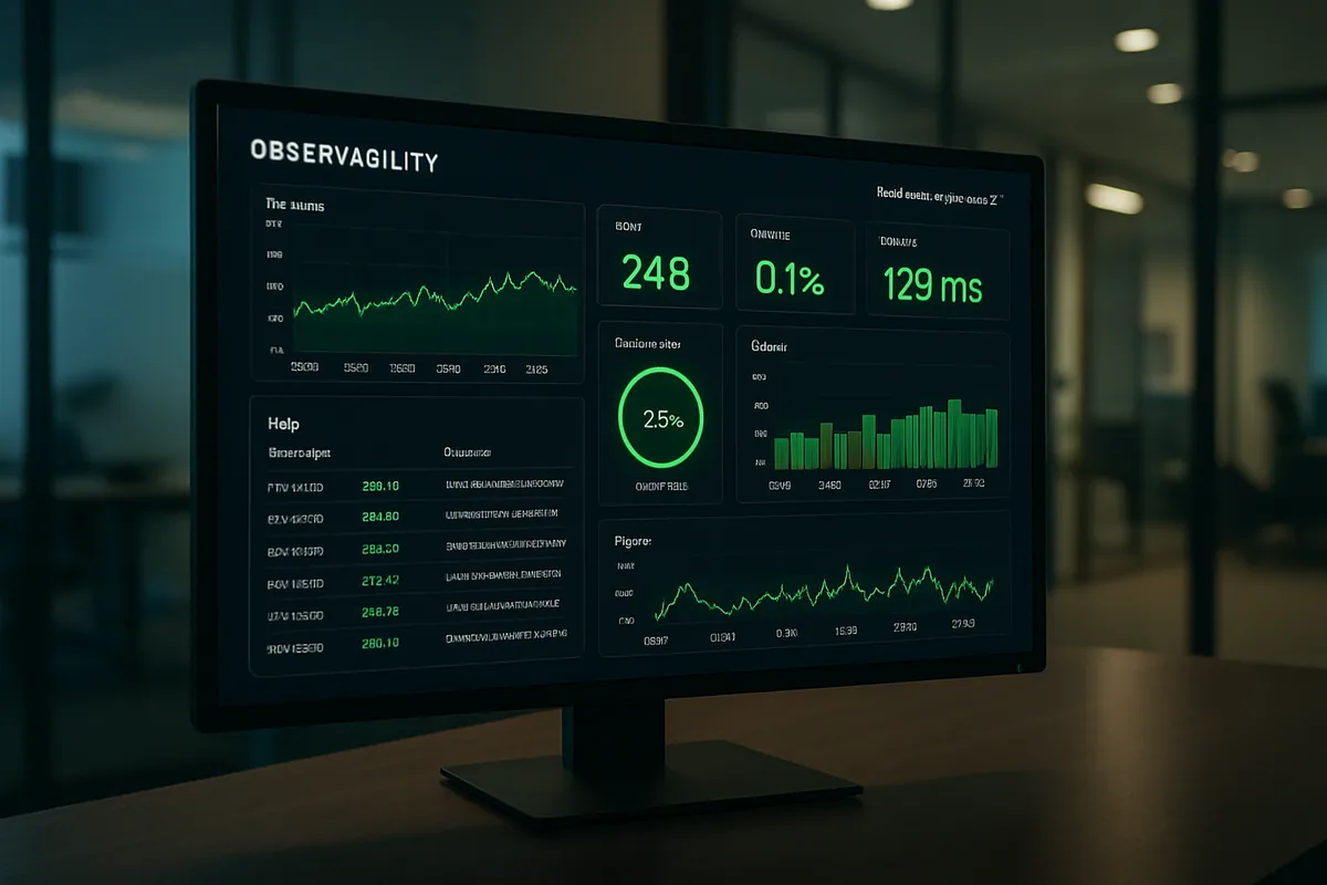
Most teams find out their application is slow the same way their users do: something breaks, a customer complains, and everyone scrambles to reconstruct what happened. Monitoring flips that around. Done well, it tells you a checkout page got 300ms slower this morning before the support tickets arrive, and it points at the query that caused it. This post walks through how to instrument a production application, which signals actually predict user pain, how to keep alerts trustworthy, and how to close the loop from a dashboard reading to a shipped fix that makes the app measurably faster.
Key takeaways:
- Observability rests on three data types: metrics, logs, and traces. OpenTelemetry treats each as a distinct signal with its own purpose (OpenTelemetry).
- Google's SRE practice narrows the noise to four golden signals for user-facing systems: latency, traffic, errors, and saturation (Google SRE Book).
- For the front end, Google's "good" thresholds are LCP at or under 2.5s, INP at or under 200ms, and CLS at or under 0.1, measured at the 75th percentile (web.dev).
- Real-user monitoring captures what actual visitors experience; lab tools capture reproducible conditions. You want both.
- Monitoring only pays off when it feeds a repeatable loop: observe, find the worst offender, fix it, verify the metric moved.
The Three Pillars of Observability
Observability is the ability to understand a system's internal state from the data it emits. Three signal types carry that data. Metrics are numeric measurements aggregated over time, like requests per second or memory usage. Logs are timestamped records of discrete events. Traces follow a single request as it hops across services. OpenTelemetry defines each as a separate signal because they answer different questions (OpenTelemetry).
A metric tells you that something is wrong. A latency graph spikes, and you know the app got slower at 09:14. That is where the usefulness of a raw number tends to stop. It rarely tells you why.
Logs add the detail. When the metric spikes, you go to the logs for that window and read what the application was actually doing: which errors fired, which user hit the path, what the payload looked like. Structured logs (JSON with consistent fields) beat free-text lines here, because you can filter and group them instead of grepping.
Traces are the piece teams skip and later regret. In a system with more than a couple of services, a slow request is slow somewhere, and a trace shows you where. It records the full path of one request as a set of nested spans, each with its own timing, so a 1.2-second checkout resolves into "820ms of that was one call to the inventory service" (OpenTelemetry). Without traces you are guessing which hop to blame.
| Signal | Answers | Best for | Watch out for |
|---|---|---|---|
| Metrics | Is something wrong, and when? | Dashboards, alerting, trend lines | High-cardinality labels blow up storage |
| Logs | What exactly happened? | Root-cause detail, audit trails | Volume and cost; noise without structure |
| Traces | Where in the request path is the time going? | Latency in distributed systems | Sampling decisions affect what you can see |
You do not need all three on day one. Metrics plus structured logs get a small app a long way. Add tracing when requests start crossing service boundaries and "which service is slow" becomes a real question.
APM and Real-User Monitoring: Two Views of the Same App
Application Performance Monitoring (APM) instruments your server-side code to record how requests move through it: response times per endpoint, database query duration, error rates, throughput. Real-user monitoring (RUM) instruments the browser instead, capturing what actual visitors experience on their real devices and networks. APM tells you the backend served a page in 180ms. RUM tells you the visitor on a mid-range phone waited 4 seconds because of render-blocking scripts. Both are true, and you need both.
Here is the trap. Your server metrics can look perfect while users suffer. A fast API response says nothing about the JavaScript that runs afterward, the fonts that block text, or the third-party tag that stalls the main thread. Backend-only monitoring is a common blind spot, and it is exactly why front-end perf gets its own section below.
Lab data (synthetic tests run under controlled conditions) complements field data (RUM from real sessions). Lab tests are reproducible and great for catching regressions in CI before release. Field data is the ground truth of what people actually got. Google's guidance is explicit that the two serve different jobs and both belong in a serious performance workflow (web.dev). Our own web application performance optimization work almost always starts by reconciling the gap between a client's clean lab numbers and their messier real-user data.
The Signals Worth Watching
If you monitor everything, you effectively monitor nothing, because no human can watch a hundred graphs. Google's SRE practice recommends four golden signals for user-facing systems: latency, traffic, errors, and saturation (Google SRE Book). Get these four right and you catch the large majority of problems that hurt users, without drowning in dashboards.
A note on latency that people learn the hard way: watch percentiles, not averages. An average response time of 200ms can hide the fact that one request in twenty takes three seconds. The p95 and p99 are where your angriest users live. A healthy p50 next to an ugly p99 is a real and common shape, and the average smears both into a comfortable lie.
Saturation is the signal teams underweight. It measures how full your most constrained resource is, whether that is CPU, memory, connection pool, or disk. Saturation is a leading indicator. A connection pool creeping toward 100% will tank latency soon, and watching it lets you act before the incident instead of during it.
| Signal | What it measures | Typical alert trigger | Common cause |
|---|---|---|---|
| Latency | Time to serve a request (track p50/p95/p99) | p99 crosses your SLO for N minutes | Slow query, cold cache, downstream stall |
| Error rate | Share of requests that fail | 5xx rate above baseline | Bad deploy, dependency outage, timeout |
| Saturation | How full the tightest resource is | Resource sustained above ~80% | Traffic growth, leak, undersized instance |
| Throughput | Requests handled per unit time | Sudden drop or spike vs. baseline | Outage upstream, traffic surge, retry storm |
Thresholds here are starting points, not gospel. The right number for your p99 alert is whatever your service-level objective demands, and that comes from what your users tolerate, not from a blog table.
Front-End Performance Lives in Core Web Vitals
For anything users load in a browser, "fast" has a specific, measurable definition. Google's Core Web Vitals are three metrics tied to real user experience: Largest Contentful Paint (LCP) for loading, Interaction to Next Paint (INP) for responsiveness, and Cumulative Layout Shift (CLS) for visual stability. They are the front-end equivalent of the golden signals, and they are measured on real visitors, at the 75th percentile of page loads (web.dev).
The thresholds are published and stable. A page is "good" when LCP is 2.5 seconds or faster, INP is 200 milliseconds or faster, and CLS is 0.1 or lower, all at the 75th percentile (web.dev). The 75th-percentile part matters: hitting the target for your median visitor is not enough, because a quarter of your traffic can still be having a bad time.
Each vital points at a different class of fix. Poor LCP usually traces back to a slow server response, render-blocking resources, or a large hero image, so you look at caching, critical CSS, and image optimization (web.dev). Poor INP means the main thread is busy when someone clicks, which points at heavy JavaScript and long tasks (web.dev). Poor CLS is layout jumping around as things load, usually images or ads without reserved space (web.dev).
| Metric | Measures | Good (75th percentile) | Where to look first |
|---|---|---|---|
| LCP | Loading — largest element painted | ≤ 2.5s | Server response, images, render-blocking CSS/JS |
| INP | Responsiveness — click to next paint | ≤ 200ms | Long JavaScript tasks on the main thread |
| CLS | Visual stability — unexpected shifts | ≤ 0.1 | Unsized media, injected content, late fonts |
The practical move is to pull field Core Web Vitals for your real users, sort pages by how many visitors are getting a poor experience, and start at the top. That is a straight line from monitoring data to a work queue.
Alerting That Doesn't Cry Wolf
An alert should mean a human needs to act now. When alerts fire on every minor blip, people mute the channel, and the muted channel is where the real outage eventually hides. The Google SRE book is blunt about this: paging a human is expensive, and an alert that cannot be acted on is noise that erodes trust in the whole system (Google SRE Book).
A few habits keep alerts credible. Alert on symptoms your users feel, like rising error rates or latency breaching your SLO, rather than on internal causes that may not matter, like a single node's CPU. Require a condition to persist before paging, so a two-second blip does not wake anyone. Separate the tiers cleanly: pages are for "act now," tickets are for "look at this today," and dashboards are for everything you want visible but not shouted.
Tie the threshold to an error budget where you can. If your objective is 99.9% success, you have a budget for the 0.1% that fails, and you alert when you are burning that budget faster than the period allows. This shifts alerting from arbitrary numbers toward something your users' actual tolerance defines, and it stops the endless argument about whether 500ms or 800ms is "the" threshold.
Turning Monitoring Data Into Faster Software
Monitoring that nobody acts on is just expensive decoration. The value shows up in a loop you run on repeat. Observe your baseline across the golden signals and Core Web Vitals. Find the single worst offender by user impact, usually the slow endpoint or the page hurting the most real visitors at p75. Diagnose it with traces and logs down to a specific query, script, or call. Fix that one thing. Then verify the metric actually moved, and only then move to the next offender.
The discipline is in the last step. Teams love shipping the fix and hate confirming it worked, which is how "optimizations" quietly make things worse. Because the improvement showed up on the same dashboard that flagged the problem, you get a clean before-and-after. That is the whole payoff of instrumenting the app: the graph that found the pain also proves the cure.
This is steady work, not a one-time project, and it pairs naturally with ongoing application maintenance and support. Traffic grows, dependencies change, a new feature ships a heavy script, and last quarter's healthy p99 drifts. The loop is what keeps a fast app fast instead of letting it decay between big rewrites.
One caution worth stating plainly: correlation from a dashboard is a hypothesis, not a verdict. A latency spike that lines up with a deploy is a strong lead, but confirm it with a trace before you roll anything back. Good monitoring makes you faster at forming the right hypothesis. It does not excuse you from checking it.
Frequently asked questions
Monitoring is watching known signals against known thresholds: you decide in advance what to measure and alert on, like error rate or CPU. Observability is the broader ability to ask new questions about your system after the fact, using rich data you already emit. OpenTelemetry frames the raw material of observability as three signals — metrics, logs, and traces — that together let you understand internal state from external output ([OpenTelemetry](https://opentelemetry.io/docs/concepts/observability-primer/)). In practice you build monitoring on top of observable systems.
Start with Google's four golden signals for user-facing systems: latency, traffic, errors, and saturation. Latency tracked at p95 and p99 tells you what slow users feel; error rate flags failures; saturation warns you before a constrained resource tips over; traffic gives context for the rest. The SRE guidance is that if you can only measure four things, these four cover most user-facing incidents ([Google SRE Book](https://sre.google/sre-book/monitoring-distributed-systems/)).
Google's thresholds for a "good" experience, measured at the 75th percentile of real page loads, are LCP of 2.5 seconds or faster, INP of 200 milliseconds or faster, and CLS of 0.1 or lower ([web.dev](https://web.dev/articles/defining-core-web-vitals-thresholds)). The 75th-percentile rule is deliberate: it means you have to serve a good experience to most visitors, not just your median one, before a page counts as passing.
A trace records one request's full journey across your services as a set of timed spans, so a slow response resolves into exactly which hop consumed the time ([OpenTelemetry](https://opentelemetry.io/docs/concepts/signals/traces/)). In a system with several services, a metric can tell you a request was slow but not where; the trace shows you it was one database call or one downstream API. That turns "the checkout is slow" into a specific, fixable target.
Alert on symptoms users feel rather than internal causes, require conditions to persist before paging, and separate pages ("act now") from tickets ("look today") from dashboards ("just visible"). Google's SRE practice stresses that every page should be actionable, because unactionable alerts train people to ignore the channel where the real outage will eventually appear ([Google SRE Book](https://sre.google/sre-book/monitoring-distributed-systems/)). Tying alerts to an error budget helps replace arbitrary thresholds with your users' real tolerance.
No, but it is a strong default. OpenTelemetry is a vendor-neutral standard for generating and collecting metrics, logs, and traces, which means you instrument once and can switch backends later without re-instrumenting ([OpenTelemetry](https://opentelemetry.io/docs/)). A small app can begin with basic metrics and structured logs from whatever stack it already uses, then adopt OpenTelemetry tracing as the system grows and lock-in becomes a real cost.
Further Reading
- Core Web Vitals — web.dev
- OpenTelemetry documentation
- Monitoring Distributed Systems — Google SRE Book
Ready to Make Your App Faster and More Reliable?
Monitoring is only worth it when the data turns into fixes. Silicon Prime instruments production applications, reads the signals that predict user pain, and closes the loop into measurable performance gains. Reach out if you want a second set of eyes on your latency, error rates, or Core Web Vitals.
Comments