A 400-location operations center might surprise visitors with its tranquility. Instead of chaos, there's a systematic approach to monitoring and managing site performance. This article explores how data-driven insights guide regional managers and ensure smooth operations across multiple locations.
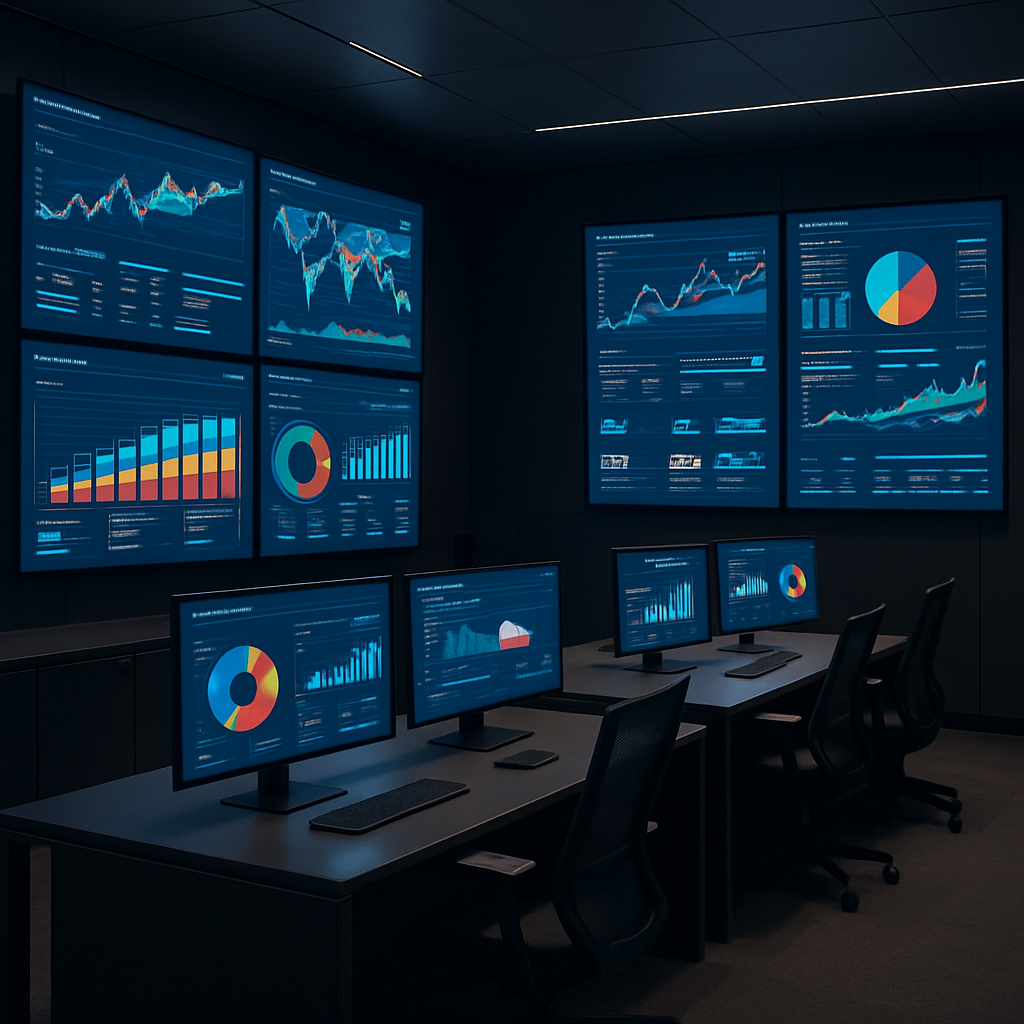
📊 The Wall is the Product
Every site is a dot. Green is normal. Amber is a question. Red is a phone call. The whole room is built around making sure red is rare and explained.
📈 What the Dashboards Actually Measure
Not vanity numbers. The screens here track the things a regional manager can act on before lunch.
- Exceptions, not totals. The board surfaces the sites that fell out of pattern, not the 409 that didn't.
- Time-to-acknowledge. How long an amber sits before a human reads it.
- Repeat offenders. A site that goes amber three weeks running is a process problem, not a bad day.
A good operations wall doesn't tell you everything is fine. It tells you exactly where to look when it isn't.
When comparing tools like Tableau or Power BI, these dashboards focus on actionable insights rather than sheer data display.
📷 What You Don't See in the Photo
The room looks calm because the hard work happened upstream — in the way the data is shaped before it ever reaches a screen.
The lesson we took home is the one we keep relearning. The interesting AI work is not the screen. It is the discipline of deciding what deserves a dot, what deserves a color, and what deserves a human.
Further Reading
🚀 Ready to Build with AI?
Contact Silicon Prime — we help companies design and ship production-grade AI products.
Comments